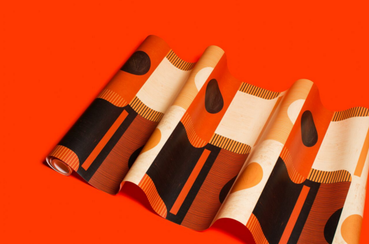
In Shooting the Shit, NATIVE talks to Nashvillians who are doing things a little differently—think of it as grabbing a quick cup of coffee with that screenprinter or tattoo artist you keep seeing on your Explore Page. This month, we chatted with Kelly Diehl and Elizabeth Williams, the founders of New Hat Projects. Since 2016, Diehl and Williams have given a slew of Nashville businesses and events (8th & Roast, Lemon Laine, and Dozen Bakery, to name a few) aesthetic facelifts that feel timeless yet innovative. When you walk into a space designed by New Hat, you somehow feel transported to some exotic locale and at home—and you’ll probably feel the urge to snap a quick selfie in front of one of their wallpaper prints.
Keep reading to check out our conversation with Diehl and Williams, and be on the lookout for more New Hat spaces around town. Believe us, you’ll know them when you see them.
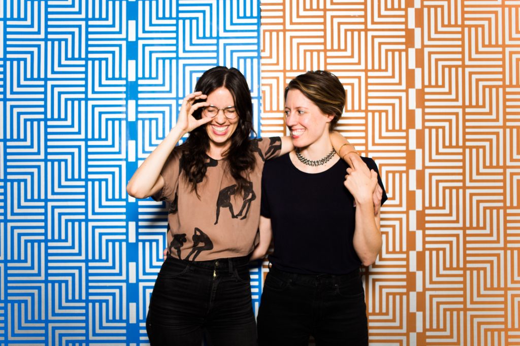
Tell us how you two met and how the idea for New Hat came about.
We met through a mutual friend and clicked in many ways. We always talked about doing a project together, so a few years later when Claire Meneely asked Elizabeth to make wallpaper for Dozen Bakery’s restrooms, we decided to make it a collaboration. We worked together well and people really responded to the art. A year later we were still thinking about it and feeling restless. We thought about collaborating on another project, but the conversation turned into How can we make collaborating our job? So we decided to start a business instead, New Hat.
Collection One is New Hat’s first foray into product design. What made you all decide to add products to the installation work you were already doing? Did the transition come with any unexpected challenges?
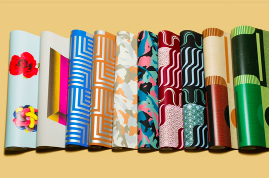
Our business needed to grow beyond custom installations to become more sustainable. We also had people contacting us about products they could buy from us that weren’t custom, so long story short, we hired a business manager to help us launch a collection of ready-made wallpapers. The biggest challenge we had was outsourcing some of our printing to a company in Chicago. Long-distance relationships are . . . difficult.
You’ve mentioned that your work is influenced by everything from “pre-colonial Peru to 1950s Japan to visions of human futures in distant solar systems.” Was there a prevailing influence behind Collection One?
Since it was our first collection, it felt important to speak to the span of cultures and time periods that influence us and to speak to our artistic range. Each pattern is its own strange hybrid. “Plinth” = Japanese design + Brutalism + Edward Hopper, while “Minerva” = Medieval armor + Vienna coffee house + 1970s groove. The quality that does unite them all is a strong, specific color palette—and the fact that they came from our weirdo brain meld.
One of the things we admire most about your work is how you can make every part of a space or event feel cohesive. At the NFA Honors Awards, for instance, the invites, stage design, and even photo booth came together to create this awesomely consistent world. How do you meld such disparate elements to make something that still feels unified?
With large spaces or events sometimes less is more. For NFA Honors we created a simple graphic vocabulary that lent itself to many forms. Your brain can easily recognize the elements as part of the group, no matter what scale, formation, or material they’re in. Plus, color and pattern are human connectors. Event design can be too serious for its own good.
Because your art often exists in public spaces like local restaurants or shops, do you think the average passerby overlooks it as “art”? Does that distinction matter to you at all?
The distinction only matters as an invitation to redefine what one generally thinks is “art.” Instagram has made people more aware of designed environments—the more distinctive the better. Unfortunately, that can be a slippery slope toward desperate, bad design. We mainly hope our artwork enhances someone’s experience of architecture and inspires them to keep looking up.
Do you think wallpaper in general is experiencing a revival right now? And if so, where does New Hat fit into that revival?
Wallpaper is definitely experiencing a revival. It’s in Target. Wallpaper carries with it feelings of nostalgia and immersive comfort. Color and pattern are energetic and joyful. It makes sense that people would welcome all of these qualities into their homes during an era of social upheaval and disconnectedness—are we taking this too far? New Hat acknowledges the revival and hopefully adds a bold and informed voice to the party.
To see more of New Hat Project’s work, visit newhatprojects.com.
Suggested Content
Chelsea Kaiah James
Why aren't there any ears sculpted onto the presidents of Mt. Rushmore? Because American doesn't know how to listen. - Unkown
Contributor Spotlight: Dylan Reyes
When I create, I often think of what Johannes Itten said, “He who wishes to become a master of color must see, feel, and experience each individual color in its endless combinations with all other colors.”. I’m also inspired frequently by love and loneliness and want folks consuming my work to be encouraged to start paying attention to the little details in everyday life, appreciate the simple things, and let them eventually inspire you! Ultimately, I’m just trying to become a mother fuckin master of color.
Secondhand Sorcery
A look inside the beautifully cheesy world of Crappy Magic
